A Story of Fog and War
In late 2013, Riot’s map team started to work full-tilt on updating Summoner’s Rift, the flagship map for League of Legends. It was an enormous task: not only did the team need to upgrade the map’s look and feel while preserving the bits that players loved, they needed to do it without increasing the minimum required hardware spec. Looking back, now more than a year after the launch of what we called the Summoner's Rift Update, or SRU, I think the team did an amazing job. The map is more vibrant and engaging, and it better supports the competitive integrity of the game. In this article, I’ll present just one hurdle we overcame in the project: improving the fog of war.
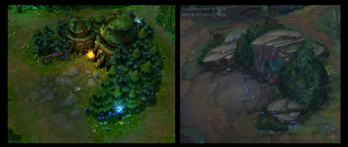
Old Summoner’s Rift vs. new Summoner’s Rift
When the map team kicked off SRU, every feature, every idea, every late-night fever dream was on the table. What would the overall art direction and style be? Where could we tighten movement paths or add new features to the map? Where the heck did that river come from? As they began to refine the vision for the new map and play around with new assets, certain things stood out like a sore thumb. Among them was the fog of war—the blanket of darkness that hides areas of the map until a team illuminates them with champions, abilities, or wards. Artists already knew that the fog of war had some visual fidelity difficulties, but against the crystallizing backdrop of the new map, it was downright ugly:
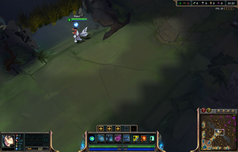
Old fog of war on a work-in-progress version of the new map
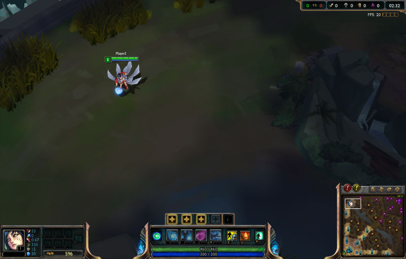
Old fog of war on a work-in-progress version of the new map #2
Notice the jaggies formed at the edges of poor Ahri’s vision and the discrete levels of gradation. Both are visually distracting from the gameplay experience. Before SRU, these issues were much less observable due to high-frequency details in the environment. (As an aside, note how much the final map was improved and polished compared to the early work-in-progress above.)
Removing the distracting gradient was a no brainer—I removed the concept of a discrete gradient in favor of a simple visibility flag. Unfortunately, smoothing the fog of war edges to remove the jaggies was not nearly as straightforward to resolve. The underlying problem arose from the low resolution of the data that comprises League’s visibility system. This was intentional—specific pieces of the game, such as shadows and visual effects, are often stored at a lower resolution to save resources and allow the game to be run on less performant hardware. In the case of the fog of war, the entire map was covered by a 128x128 grid.
One obvious solution was simply to increase the resolution of the fog of war. However, while investigating this option I realized the relevant code wasn’t performant—even a modest doubling of the resolution to 256x256 would have incurred an unacceptable performance hit in the form of a quadrupled CPU cost. A refactor of the code would have been a really fun challenge, but we simply didn’t have enough slack in our schedule to do a proper job. I started to mull over a way to improve the situation with the same underlying data.
We were already performing a Gaussian blur over the 128x128 source data before rendering it to the scene as the fog of war, so I wondered if increasing the blur might hide the ugly jaggies. Unfortunately, they are not so easily thwarted. I first noticed that the existing fog of war rendering code was not performing a separable blur. If you exploit the separability of an image filter, it’s possible to achieve the same or similar result (blurring, in this case) with much less cost. I also knew of a relatively popular technique to further reduce the cost of blurring by cleverly utilizing linear texture sampling. I went to work experimenting with different blur types and techniques but alas, more blurring on the same 128×128 image made it too blurry too quickly. The game designers wanted the transition between the visible area and the fog of war to be as defined as possible for the sake of gameplay clarity, so I needed a smooth and visually pleasing transition limited to a narrow band of gradation. It was becoming clear that I needed a higher resolution source before blurring to achieve this.
I was left with a tough decision: do I bite the bullet and find the time to refactor the entire visibility system? I was ready to sit down with our product owner and deliver some bad news—when I had an epiphany! The gameplay-impacting issue was not the precision of the underlying data, but rather its visual representation. Smartly upscaling the data from 128x128 to 512x512 (which I assumed was large enough to achieve the goals of smooth and narrow transitioning) could hugely improve the look of the fog of war. After brainstorming and deliberation, I came up with the following simple upscaling scheme:
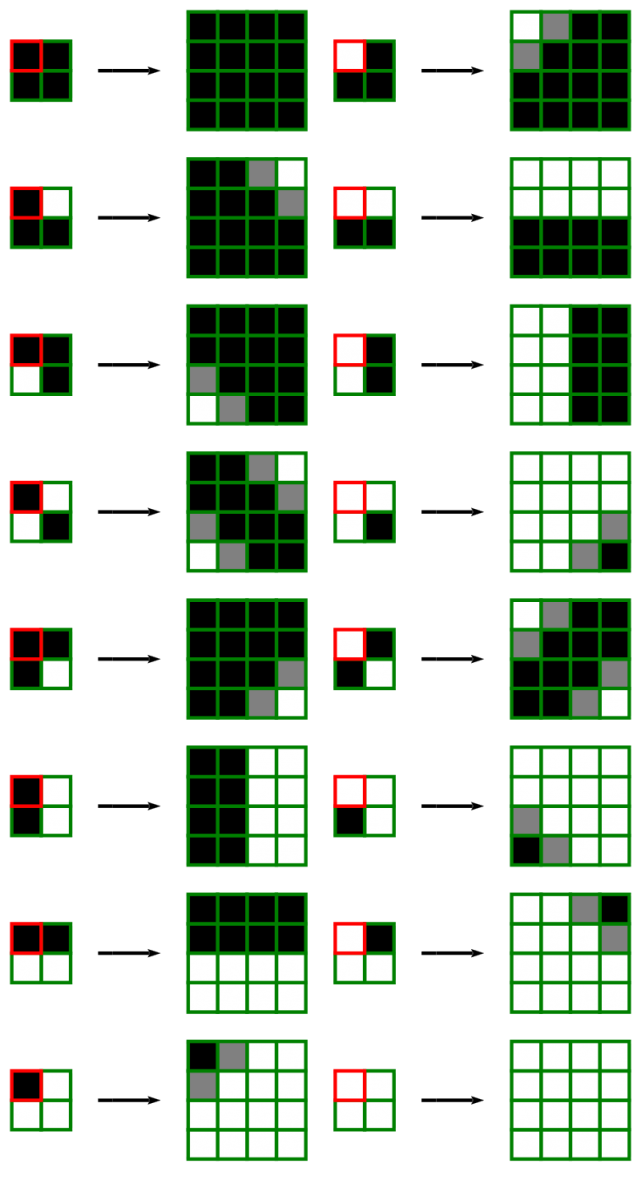
Every pixel becomes a 4x4 block with some antialiasing to get rid of jaggies once and for all
The 2×2 blocks on the left represent an original pixel (the red one) and its three neighbors in the 128×128 source image. The 4×4 blocks on the right represent an upscaled result at 512x512 complete with gray pixels or ‘antialiasing’ to ease the transition. There are 16 unique patterns in total. Here’s a comparison shot::

128×128 FoW (4x zoomed)

512×512 FoW (4x upscaled)

512×512 FoW (4x upscaled & blurred)
Had I finally defeated the jaggies? As you can see, upscaling the original data did a decent job of removing them. Advanced versions of this technique have existed for some time. If you’ve used an emulator for old game consoles, you’ve probably experienced such techniques. If you’re interested, I found this SIGGRAPH 2011 paper and this article on the topic inspirational.
Through the development of SRU, the fog of war yielded plenty more intricacies, features, and outright debacles—but I’ll spare you the gory details. Ok… maybe just one gory detail. We didn’t know it, but the old fog of war was actually darkening our maps.
The old code was actually darkening areas of the map that were totally clear of the fog of war. This means that every texture created by artists was being rendered ever-so-slightly darker than intended. And nobody had noticed! Fresh off my victory against the sinister jaggies, I was filled with confidence, so I fixed the darkening issue too. I simply adjusted the color multiplier for visible regions to 1.0 from something like 0.9—and now the game is a bit brighter. :)
Check out the gorgeous images below and compare them to the screenshots earlier. By the time SRU shipped, so much love had gone into the new map to level it up. The sweet new HUD is definitely an improvement as well!
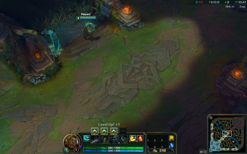
Fog of war on the current map #1
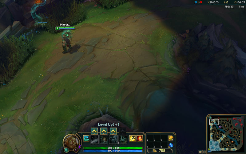
Fog of war on the current map #2
I’d love to hear any stories you have about rehauling your own features, and answer any questions you might have. Thanks!