
Down The Rabbit Hole of Performance Monitoring
Hi, I’m Tony, and I’m an engineer on League. This article is a followup to my performance series, where I talk about optimisation and profiling. This will be a high level overview of how we monitor game performance in League of Legends, how we detect when a performance degradation has slipped through QA and escaped into the wild, and how we track global trends in frame times over many patches and millions of players. I hope you enjoy it!
What’s In A Frame Rate?
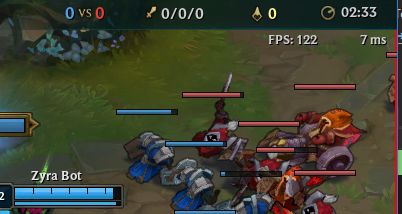
A game’s frame rate is often an important indicator of game quality. Not all games need to have a high frame rate, but some games depend on it - the better the frame rate, the better the player’s experience with that game. League is a game that’s better played at a high frame rate, so ensuring that it plays as fast as possible is a crucial part of being a League developer.
Optimising Frame Rates
How do we know how fast League is playing on a player’s machine? How fast is fast enough?
The first thing you need to realise is that to optimise something, you must first be able to measure it. If you can’t measure it, you can’t optimise it. In our case, we’re trying to optimise frame times, so we’ll start by measuring the average frame time for an entire game, as it’s a reasonable initial indicator of performance. We do need to keep in mind that this is not necessarily the most consistent metric for measuring the performance health of a game - imagine a situation where most of a match has a high frame rate, but team fights are extremely slow. While the average frame rate would look excellent, the player experience would be terrible. So after our first findings, we’ll need to validate our assumptions.
To increase the level of difficulty, we’re not looking at the performance of the game during development - we do that as well, but our developers often have above-average spec machines, so their frame times are not necessarily indicative of a player’s real experience. Instead, we’re going to look at the performance of actual games being played on our live environment. This will hopefully give us an idea of the overall performance health of League across all players and regions.
Average Frame Time Overview
Given that we want to optimise the frame time for every player for every game played, we need to measure the average frame time of every game for every player and then put all that data somewhere we can visualize it.
Through the magic of the internet, we can do this. At the end of the game, we send a small amount of performance-related data back to Riot where we can inspect it and look for trends. Here’s an example: This is a plot of the average frame time for every game for every player, plotted by day for patches 8.8 to 9.3. The vertical axis is frame time in milliseconds and the horizontal axis is date by day.
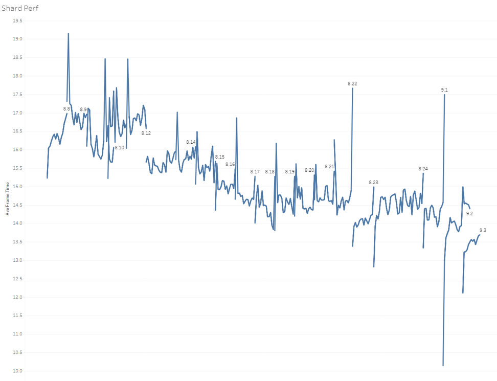
This graph is pretty messy, as it shows some very large variations. For example, patch 9.2 seems to change from 10ms to 15ms per frame over its lifetime. How can that be? Does League get slower over time during a patch? Remember, this is the game client, not the server, so it should be independent of server load or ping times. If you squint a bit, you can see that the average frame time reduces over a period of months, but it’s hard to tell from patch to patch if things get better or worse.
Plotting Frame Times by Hour
What’s going on here? Intuition would dictate that the performance of a single patch should be pretty much constant, so why are we seeing so much variation? Let’s collect some more data and see if we can figure it out. To start, let's plot the frame times by hour instead of by day.
Top plot is the average time taken by the CPU in milliseconds, the next one down is the time taken by the GPU in ms, the second from bottom is average FPS, and the bottom plot is the number of players for that hour.
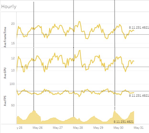
What we see here is that the number of players varies based on the time of day. It’s a diurnal curve - more people play at certain times of the day and less at others - that makes sense. Players do need to sleep occasionally and most do it fairly regularly. But what doesn’t make sense is why the frame time seems to also change in a diurnal fashion. Why does the time of day have an impact on frame time? Do computers run faster during the day and slower at night? What’s going on here?
Plotting Frame Times by Region
Let’s grab some more data and see if we can answer some of these questions. First, let’s plot the frame times by region - this way we can compare North America to Korea or Brazil to Russia.
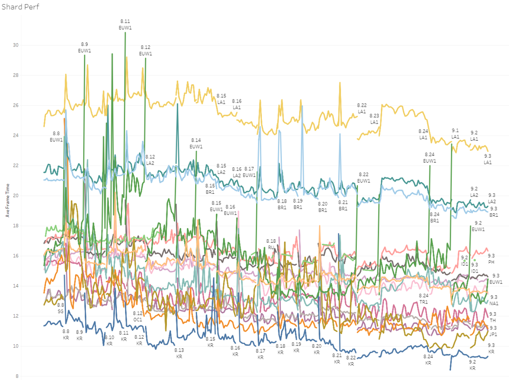
This plot is very interesting. Look at the sedimentation of the data - there are very clear performance characteristics for each region. Each individual region is still quite variable, but there is a roughly consistent shape across all the regions. Curiouser and curiouser. Why is this? And why are there such discontinuities in frame time at patch boundaries?
We could just take an average over the entire patch cycle to remove most of the spikes and discontinuities, but personally, I’d like to understand why they’re there in the first place. Ignoring data like that makes me uncomfortable - if we need to make decisions based on this data then we need to have complete confidence in it. If there’s behaviour that we don’t understand, then how can we have confidence in our data?
Utilizing PBE Data
Narrowing down our data to a single region (PBE) we can see a great example of the discontinuities in frame time over patch boundaries. This plot shows the number of players on the top, with the CPU frame time and then GPU frame time beneath that.
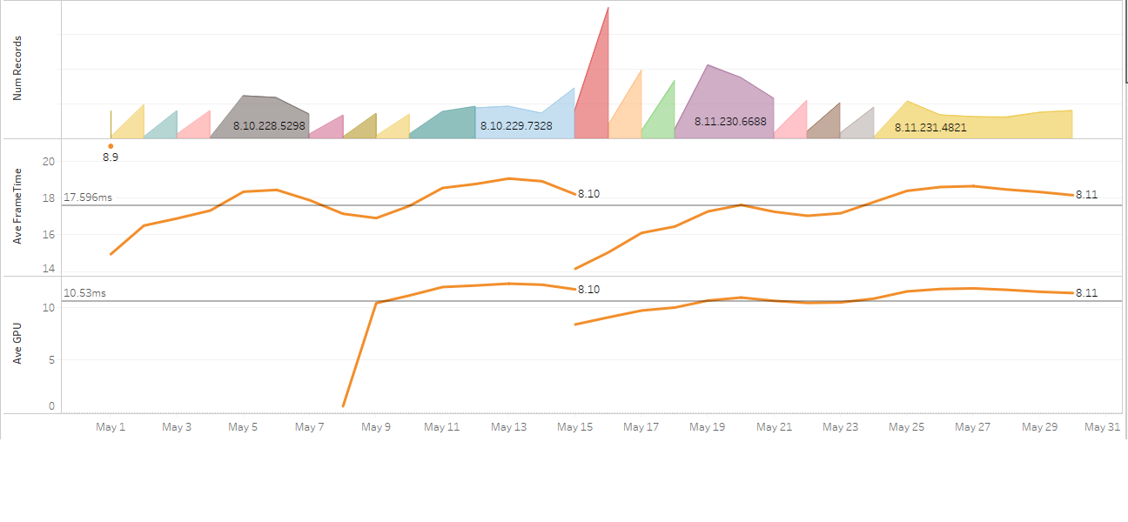
You can ignore the dip at the start of the GPU graph - that’s due to a low sample size when GPU measurements were first added. Note that the GPU is much faster than the CPU here, implying that the game is CPU bottlenecked - that rings true. Both have a sharp improvement in frame time - 4.2ms faster for the CPU and 3.3ms for the GPU. You can also see that the number of players suddenly spiked too. Patch 8.11 corresponded to the release of Pyke - did Pyke make the game faster?
Visualizing Game Speed
Unless Pyke has a secret ability that none of us know about, we need more data. Let’s look at the number of games played, coloured by by their frame time. The horizontal axis is date, the squiggly line is the CPU frame time and the red/green bar graph at the top is the number of players, coloured by their average frame time - so slower games will be redder, while faster games will be greener.
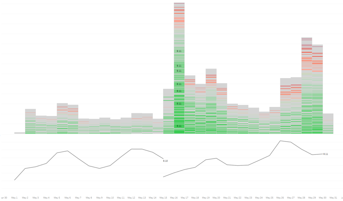
Now this is starting to make sense. What we see here is that with the release of 8.11, a disproportionate number of people are playing with faster frame rates. The number of people with slow games has stayed around the same, but more people are having faster games. Could this be due to people with faster machines dropping into PBE to check out the new champion?
Filtering by CPU
To validate this assumption, we filter our data by a single (popular) CPU - as we’re CPU-limited, the GPU usually doesn’t have an effect on overall frame time.
This is what we saw. Top plot is number of players, the middle line is CPU frame time in ms, and the bottom line is GPU frame time in ms, all plotted by date.
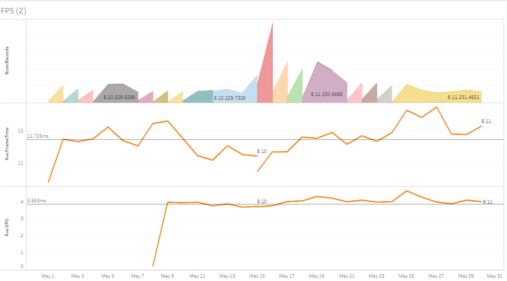
Previously we’d measured an improvement in frame time of 4.2ms, but here we’ve measured a much more sensible change of 0.5ms. The CPU graph overall has less noise as well, the variance seems to be around +/- 1.5ms. Note the different colours in the top “Number of Players” plot - each colour indicates a new deploy with new code and data to PBE. The GPU time seems to be even smoother. Looking even closer, the 0.5ms dip in CPU time seems to be due to a relatively small sample size in the first day of the transition to the new patch (the deploy happened later in the day), which introduced more noise.
Checking the Next Patch Cycle
This is promising; let’s extend the domain to look at more data. Looking at the next patch cycle, we notice even less of a discontinuity.
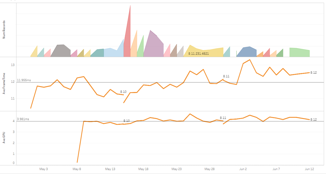
This is all looking good now. There’s still some noise in the data, but given that this is PBE with a much smaller number of players, this could be acceptable. But how accurate are these values? How can we verify that these numbers are correct?
As luck would have it, with the introduction of patch 8.13, we introduced a fix for a stall on the CPU. This stall was exactly 2ms - a great test for the accuracy of our data. If we see a change of 2ms in our data then we can be pretty confident that our data is reliable.
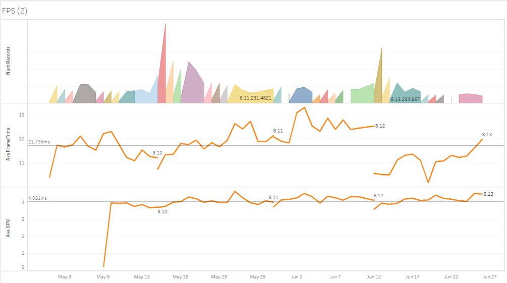
The improvement in frame time from patch 8.12 to 8.13 was 1.93ms - which is close enough to 2.0ms for me to finally have confidence in our data.
Deciding What to Measure
Like with all good problems, in retrospect the answer is obvious. Different CPUs run League at different speeds. A low-end machine will run slower than a high-end machine, so the distribution of machine specs will have an impact on the average frame times. If more low spec machines are playing the game at a given time, then the average frame time will be higher; if more higher spec machines are playing, then the frame time will be lower. This explains the diurnal behaviour of average frame times - at certain times of the day, there are more fast machines playing than at other times. The distribution of CPUs varies by time of day (which is very interesting in itself). So in order to collect accurate information we need to filter by CPU (and possibly GPU) power. Given that these metrics have an impact on the frame times we measure, we have to ask ourselves, “What else could have an impact on our frame times? What else should we be measuring?”
Frame Time Distribution
To answer that, let’s take a step back and look at the distribution of average frame times. A histogram of frame times might show us outliers or unexpected modalities. The graph below is that histogram: fast frames on the left, slow frames on the right - and the higher the bar, the more games that had the average frame time.
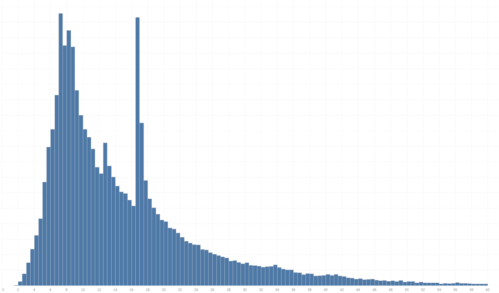
This graph is surprising - I was hoping for a nice Gaussian curve with a smooth shape but this shows spikes in a few places: 7ms, 9ms, 12ms, and 16ms. Those frame times correspond roughly to 144Hz, 120Hz, 80Hz, and 60Hz, and indicate that there are concentrations of players at those frame rates. Of course this is the result of the graphics quality settings for the game, where players can lock their frame rates to 144fps, 120fps, 80fps, or 60fps.
If we colour the histogram for those players who lock their frame rates we see the following:
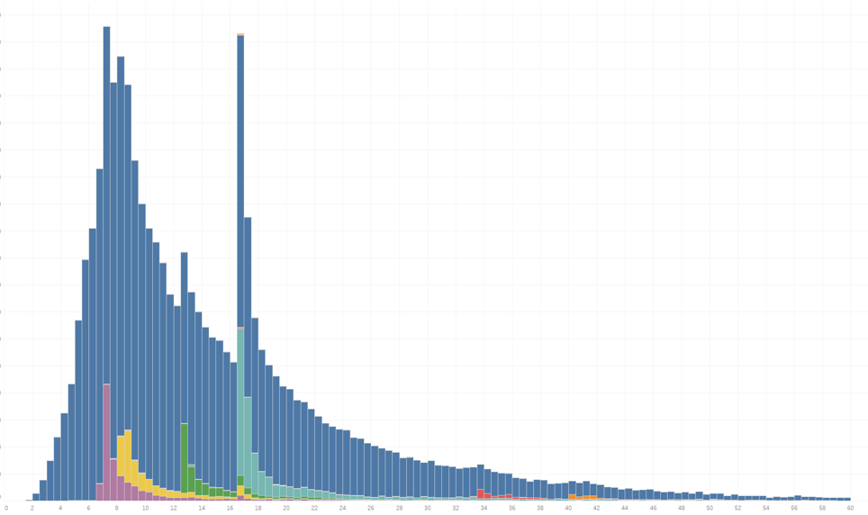
Here, we can clearly see the number of players that have capped their frame rates. If we remove those players then the histogram becomes smoother, but there’s still a big spike around 60Hz.
Gathering More Data
To try and determine what other factors are at play here, we collected lots of different information that could possibly have an impact on frame times and plotted them.
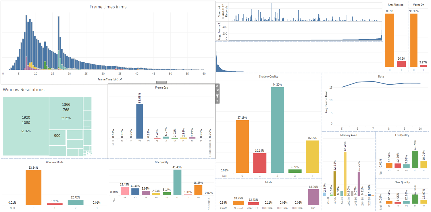
This mess of coloured boxes shows the frame time histogram (top left) as well as what each player’s settings were - their screen resolution and display mode, what CPU they used, vsync state, antialiasing state, frame cap settings, and all the graphics quality settings, as well as game modes and memory available. In this view we can select any or all of these different settings to filter by them.
The view below shows the frame time distribution for all games played at 1920x1080 with AA on and vsync off, frame capping off, graphics quality set to “Medium High,” for all URF games running on the most common CPUs.
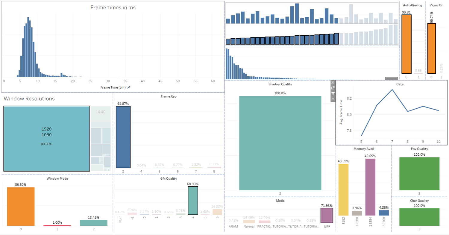
Check out the top left chart - this selection of settings gives us a nice Gaussian curve! Well, almost - there are still some games that run at 60fps, but that doesn’t seem to be League related. It could be HW related, like the GPU locking to 60Hz due to some external setting (if you have any ideas, please let me know).
Identifying Trends
This is all very interesting, but what does it show us? It tells us that if we carefully gather the frame time data from players and collate them by CPU power, graphics settings, and game mode frame cap settings, we get a nice clean distribution of frames times. If we monitor that set of machines over time, we should see a relatively accurate indication of average frame time values over time (hopefully with minimal noise), allowing us to identify trends and/or regressions.
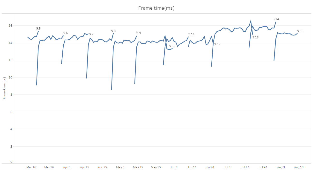
By way of an example, here is some current data. This first plot is all of the frame times from all games played with filtering (times in ms on the vertical axis, time by day horizontally). The labels are the patch versions. As we noticed before, our patches vary by up to 5 or 6 milliseconds.
Now, let’s look at all SR games in North America:
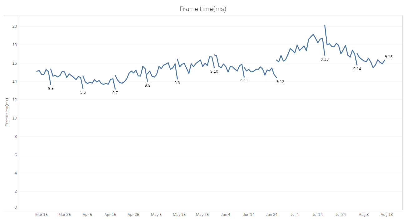
That’s better, but we’re still seeing a lot of noise throughout a patch. Refining further, we’ll only look at games which have no frame cap (well, locked to a max of 240fps) and have vsync off.
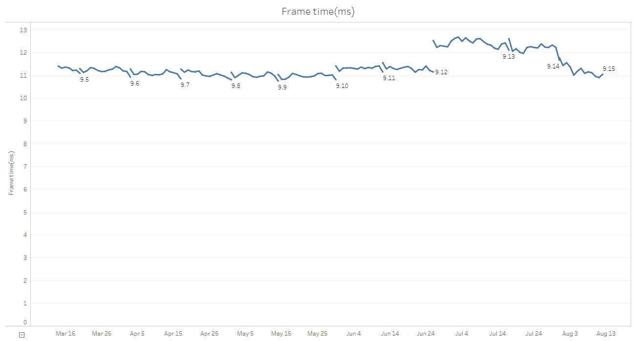
This is better again, but we’re still seeing odd transitions in and out of a patch cycle. Enhancing one more time, we’ll look at only machines within have a particular range of performance. We’ll use PassMark for now, and just look at CPUs with a PassMark score of between 7,000 and 8,000 (the higher the score the faster the computer). This is midrange for North America.
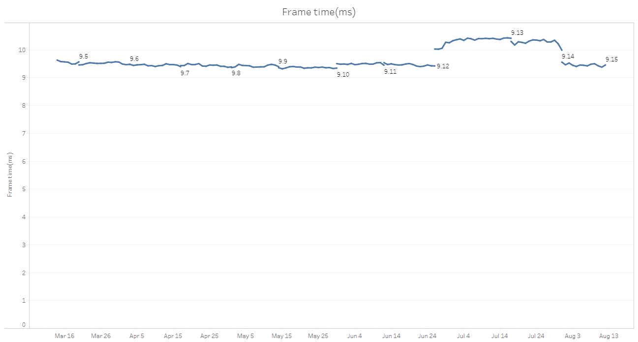
Now this looks good! Day by day we can see very slight variations in frame times (+/-0.2ms at worst for 9.13 and 9.14, with the rest around +/-0.05ms). Transitions from patch to patch are generally pretty smooth, except for 9.13 and 9.14, which stand out. Those patches are almost 1ms slower on average. In our original plots, we could see that those patches were slower, but it wasn’t clear by how much, and we would’ve had to wait a few days to see if it was a consistent trend or just noise. With this data, we can see immediately that there is a performance regression and we can attribute it to the change in patch. In this case the slowdown was due to the Arcade effects.
If we plot all of the different bands of PassMarks individually (in groups of 1,000), we see this:
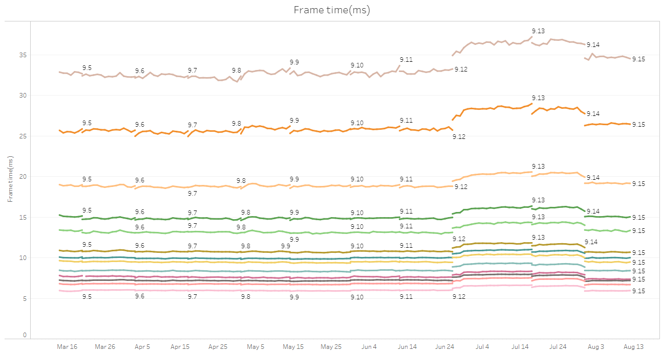
This data is fantastic! It allows us to make performance extrapolations as well as accurately pinpoint changes in performance. For example, if a developer is working on a machine which has a PassMark of 15,000 and adds functionality which slows the game by 0.5ms, then we can say with some confidence that a player with a PassMark of 2,000 will have a performance drop of about 2.5ms.
If you must have frames per second, then this corresponds to a developer’s machine dropping from 168fps to 152fps, and the players dropping from 39fps to 35fps. Knowing the average PassMark score for a region also allows us to make educated guesses as to the performance impact in that region.
Conclusion
In retrospect, this all feels pretty obvious. All the factors mentioned above have a marked impact on the speed of a game - the CPU in particular. Those factors must be taken into consideration when measuring and comparing performance, so collecting it is crucial.
Keep in mind that we’re still just measuring the average frame time over an entire game. That’s a pretty crude metric, so we need to collect a lot of data in order to reduce the noise inherent in that measurement. Fortunately, League has a pretty large player base, so we have a lot of data to sift through (which is a problem in itself).
What this gives us is the ability to see when a performance regression has slipped through QA or was triggered by a micropatch. What it doesn’t give us is the ability to determine exactly what caused the slowdown (or speed up).
We need a different set of information for that... but that’s a story for another time.